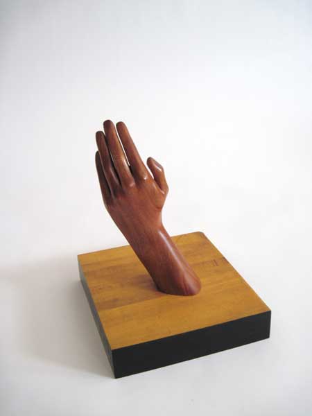
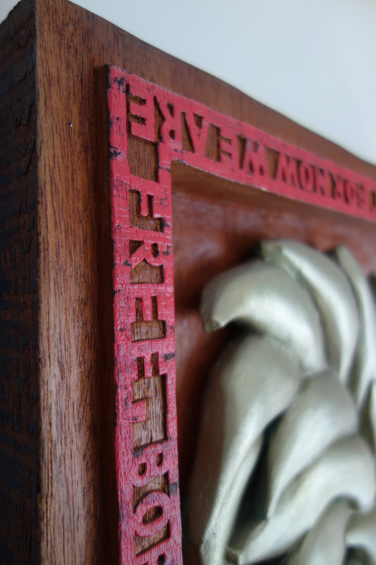
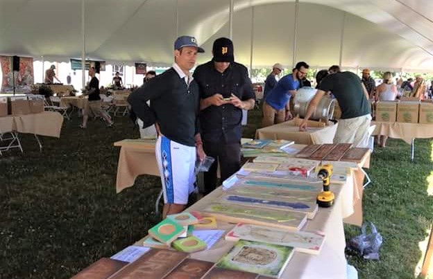
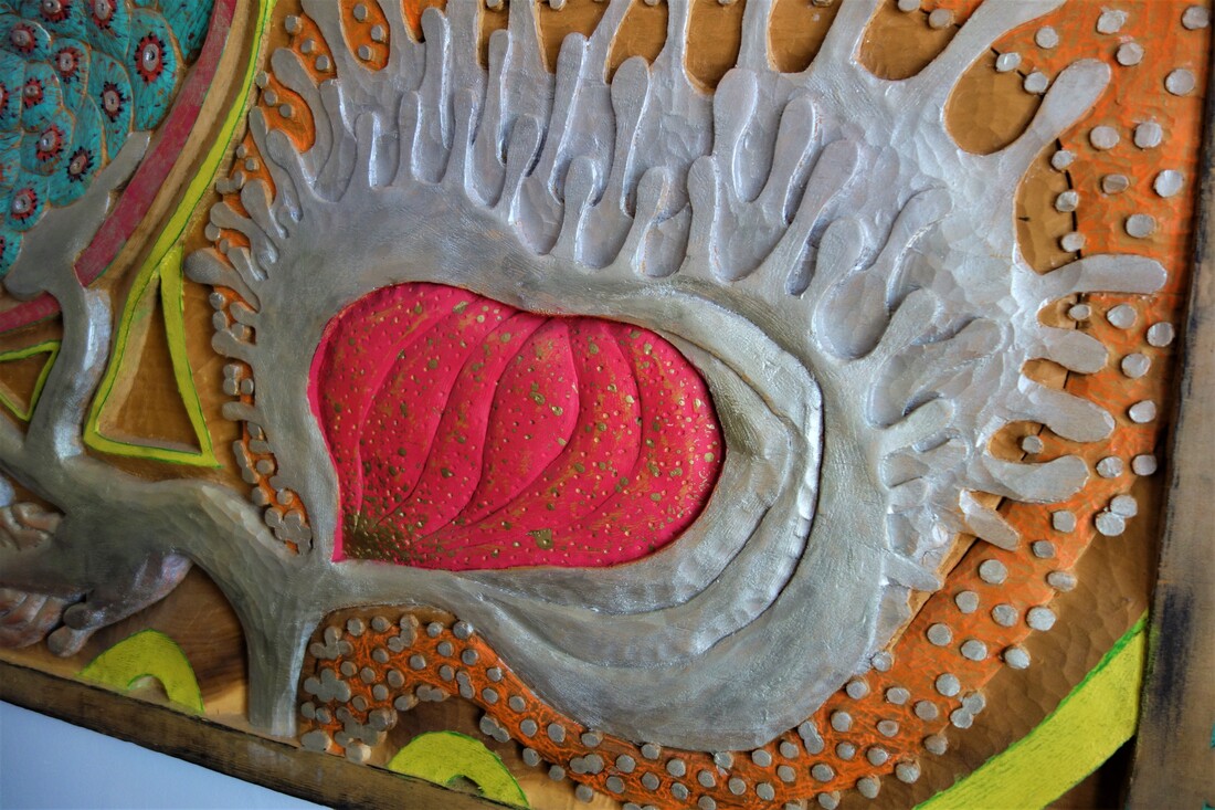
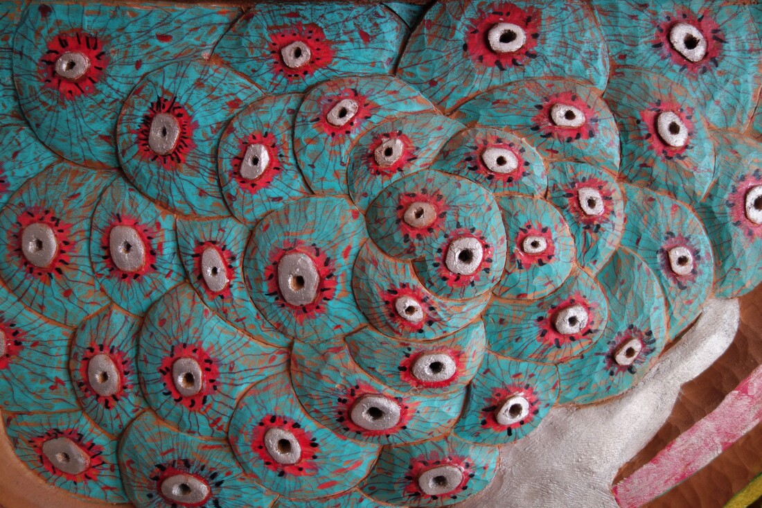
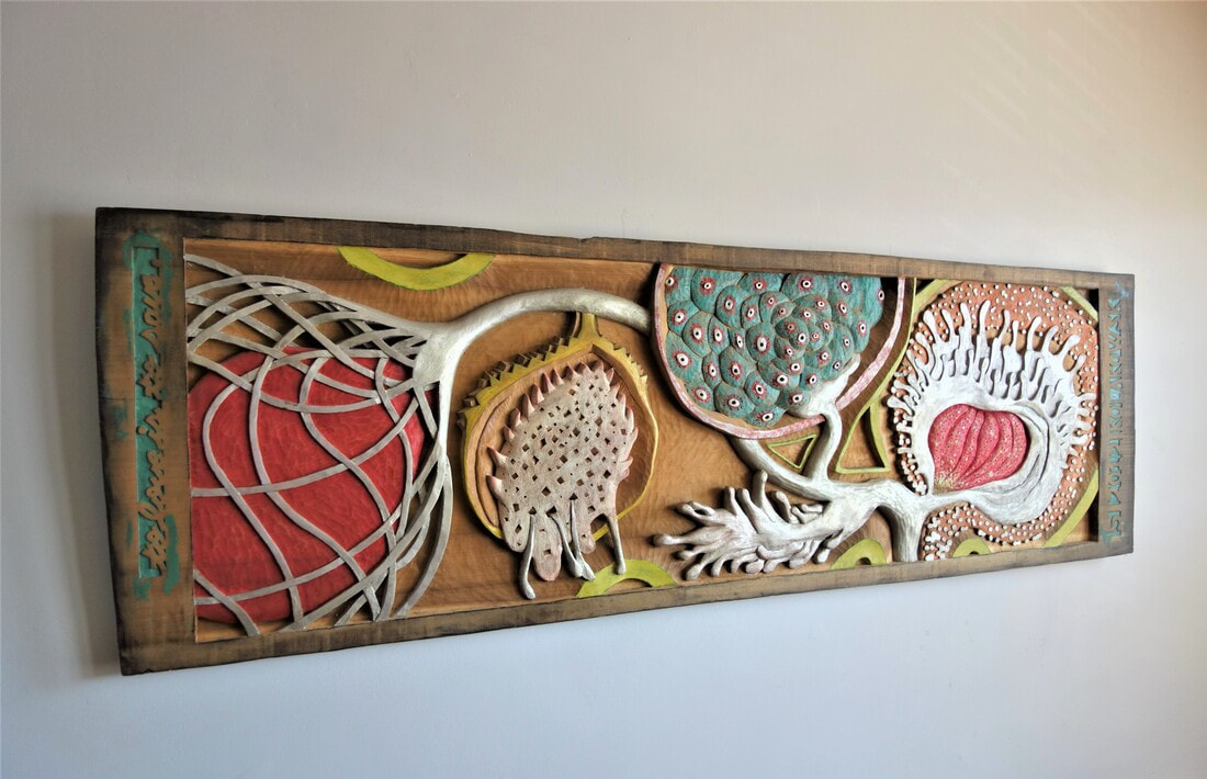
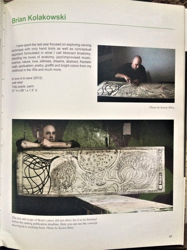
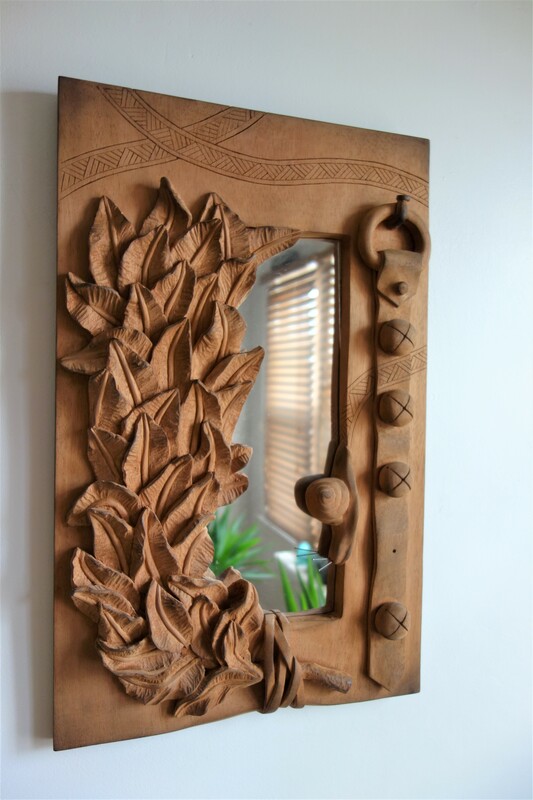
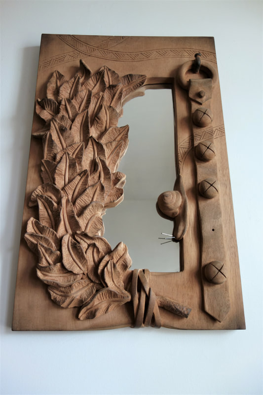
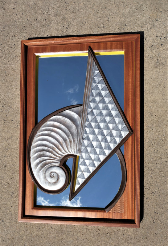
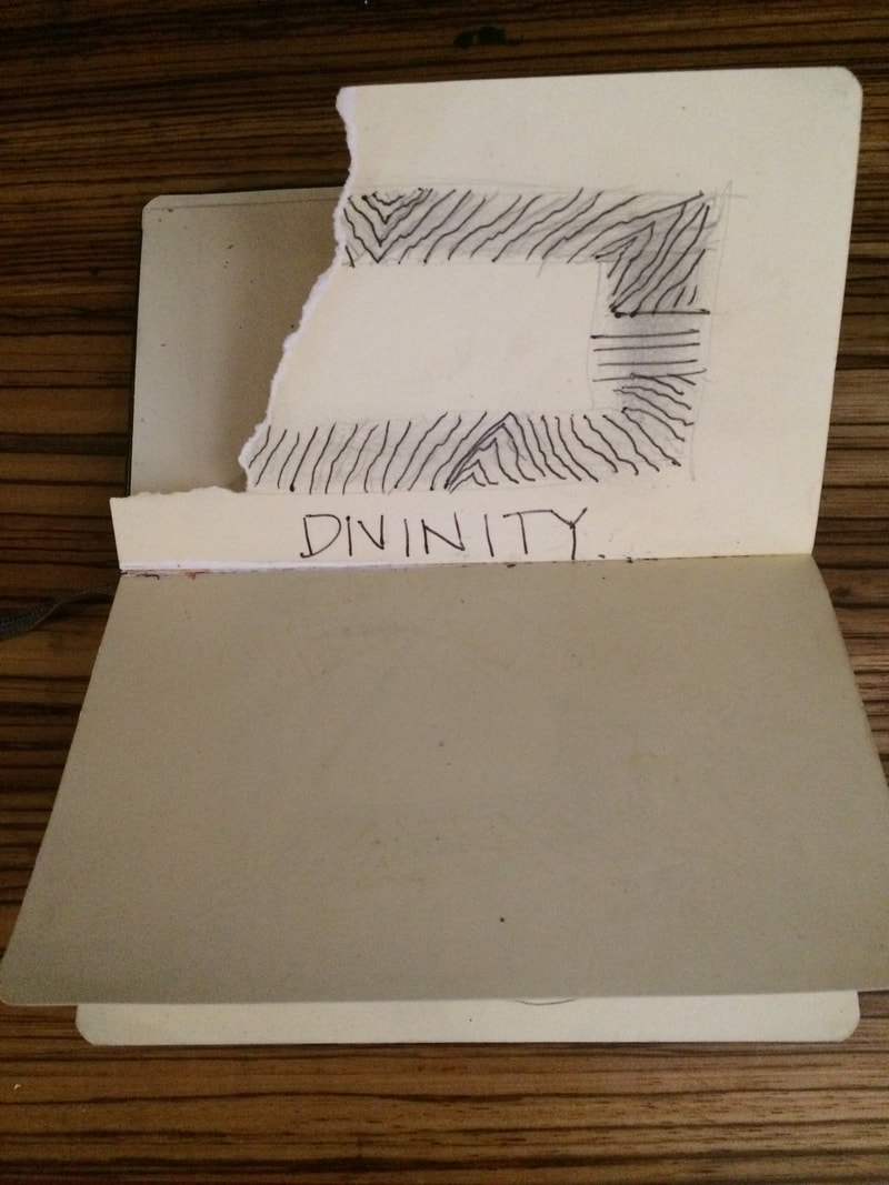
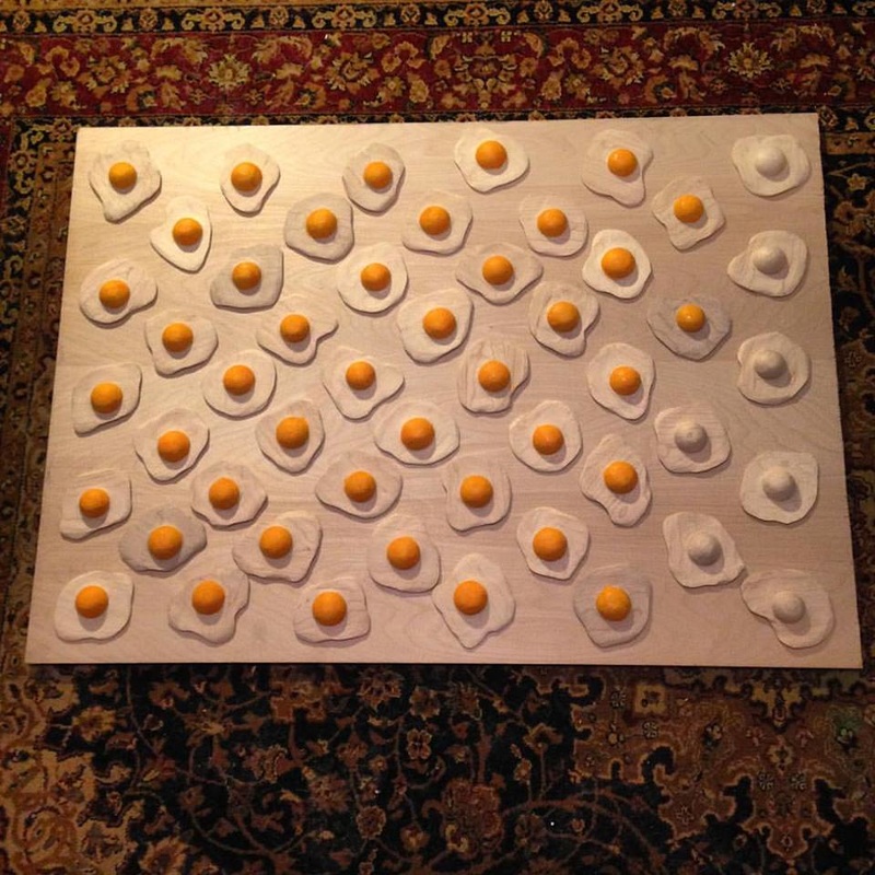
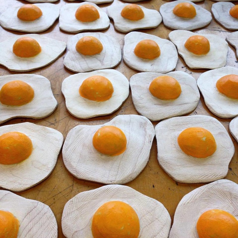
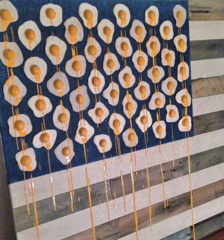
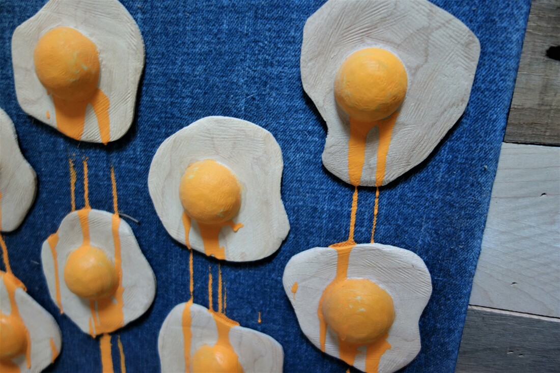
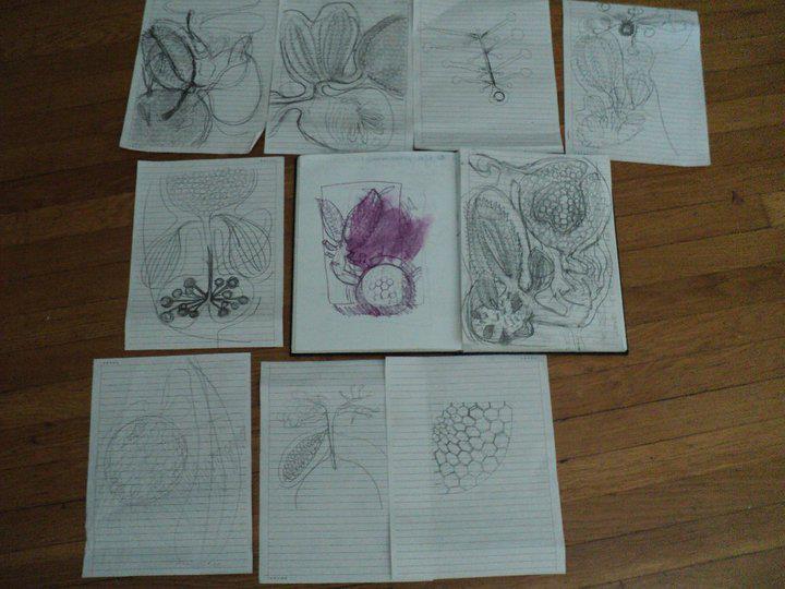
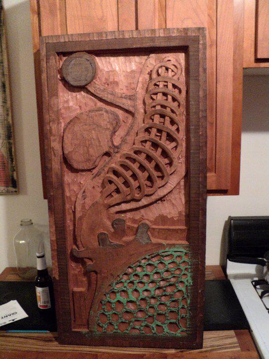
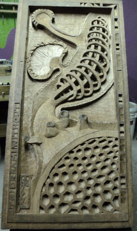
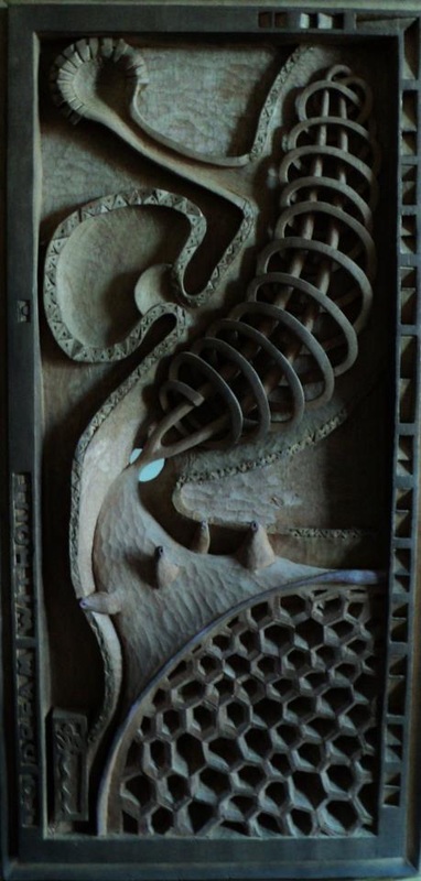
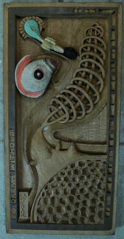
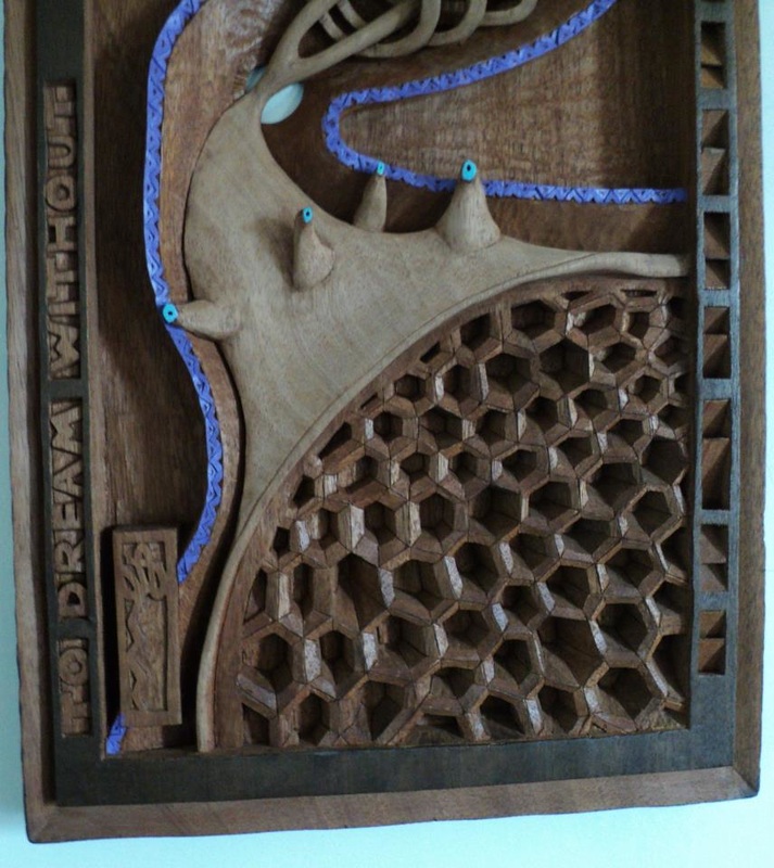
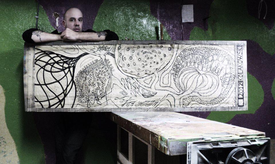
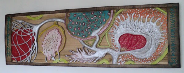
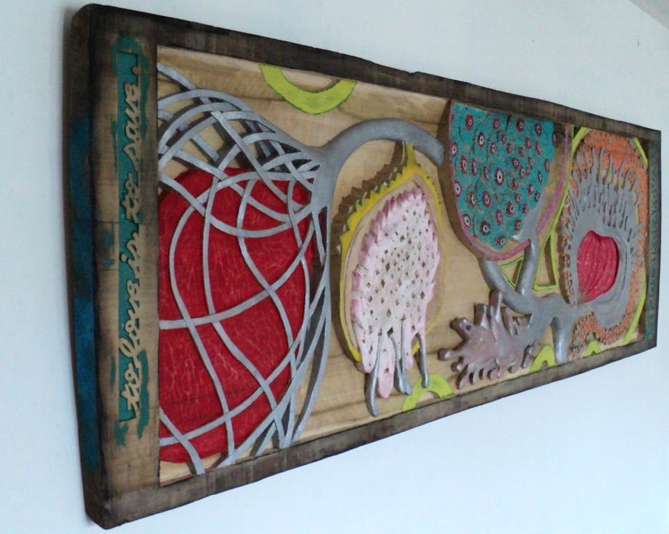
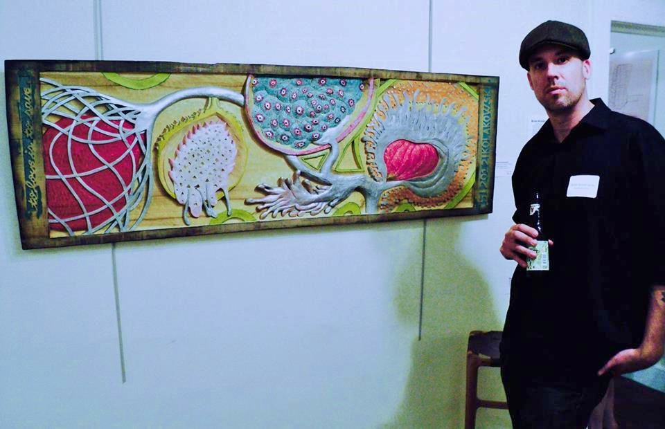
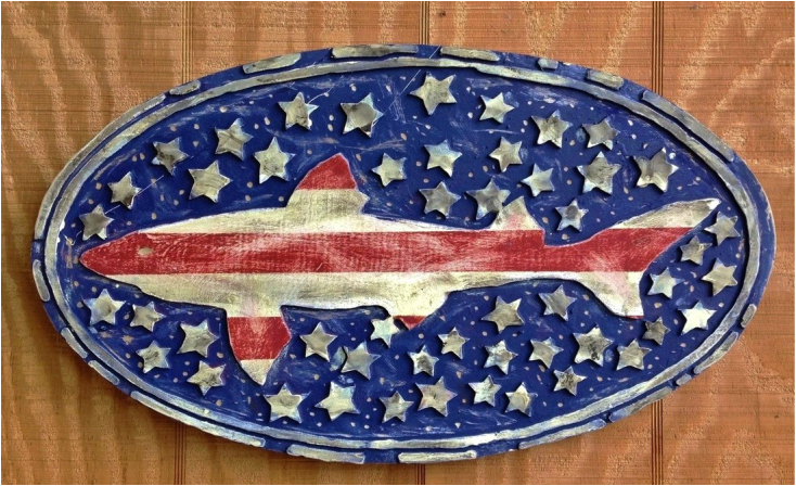
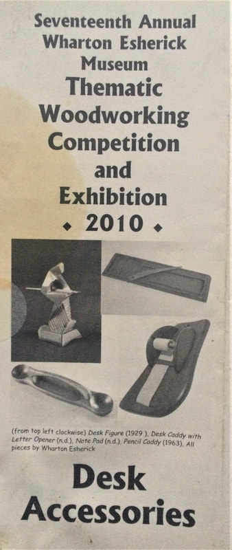
The theme for the 2010 show was …..
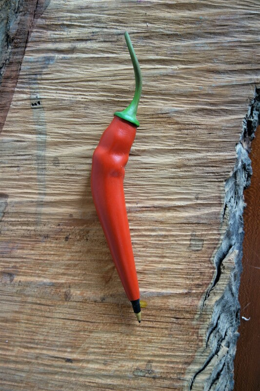
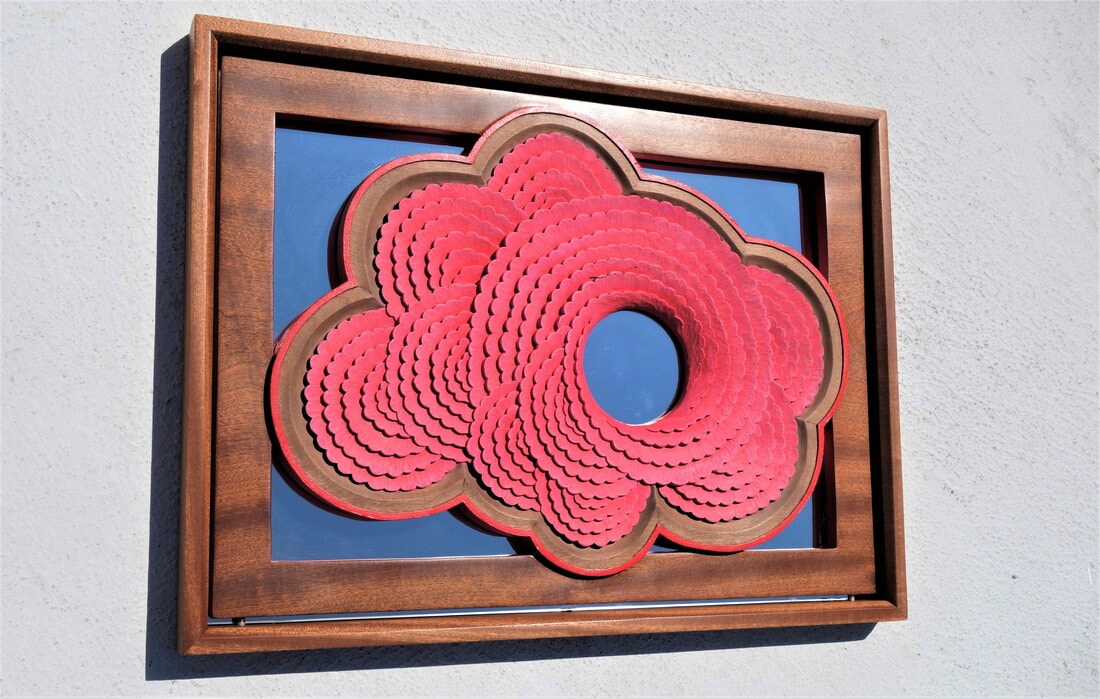
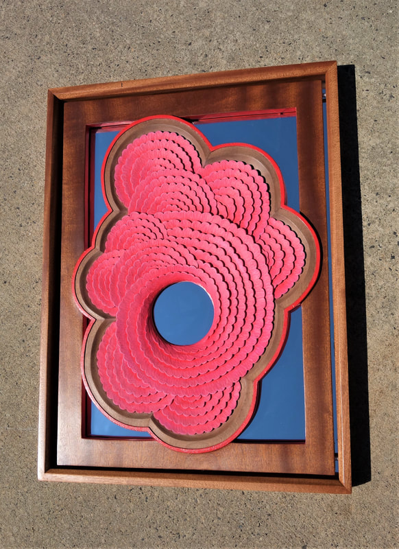
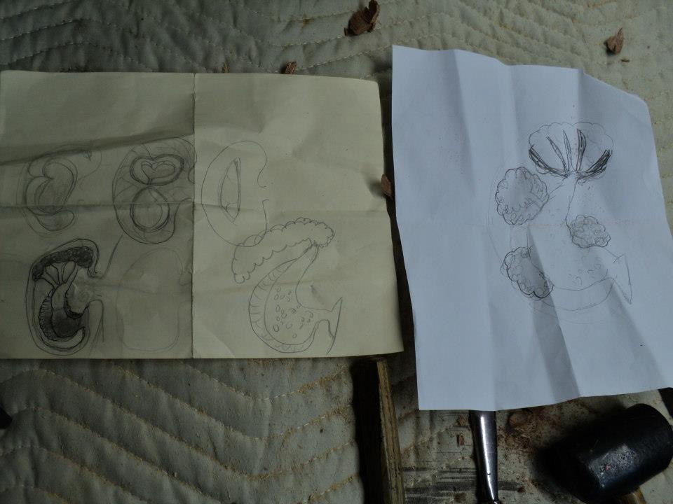
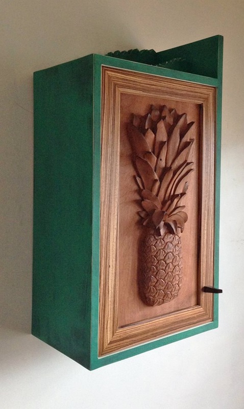
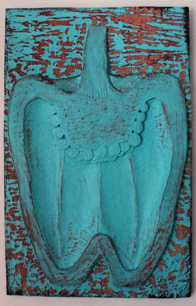
While at my brother's house my mom asked if I knew what I was making for the exhibition yet. I knew I wanted to make a pen of sorts when my mom said she really liked the large pepper carving I made earlier in the year titled A Mother's Wisdom.
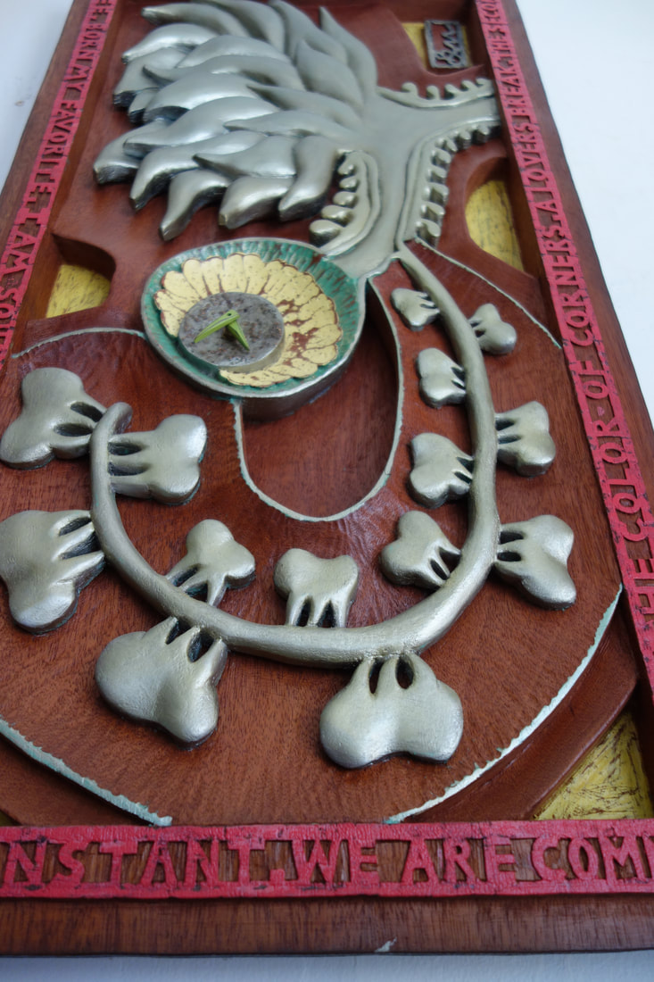
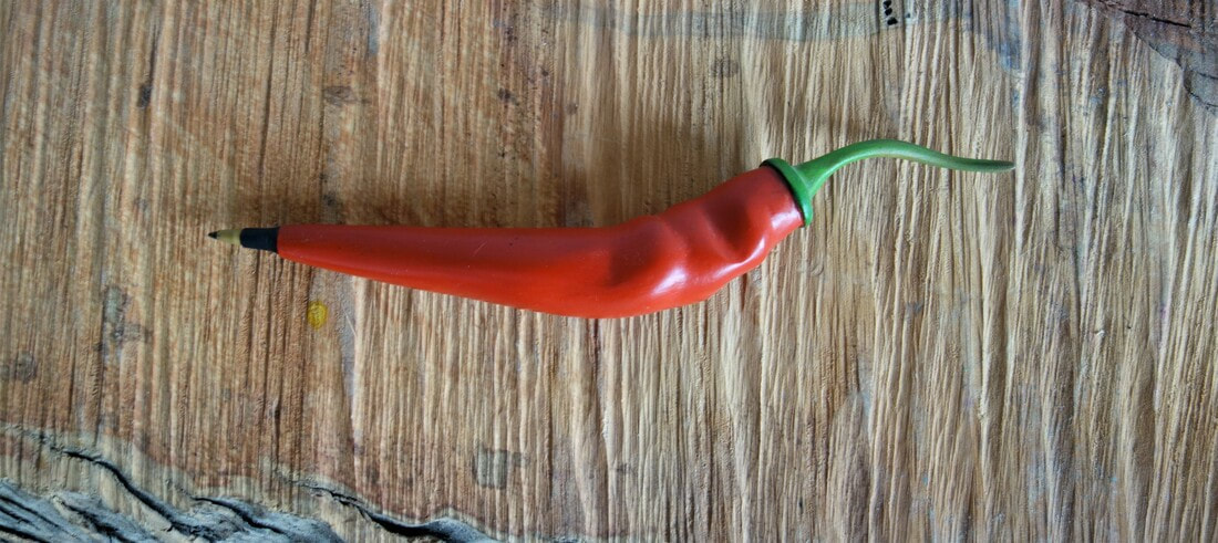
As the conversation continued it was her idea to create a pen the shape of a jalepeno pepper.
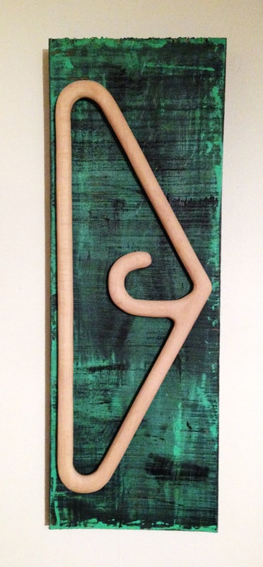
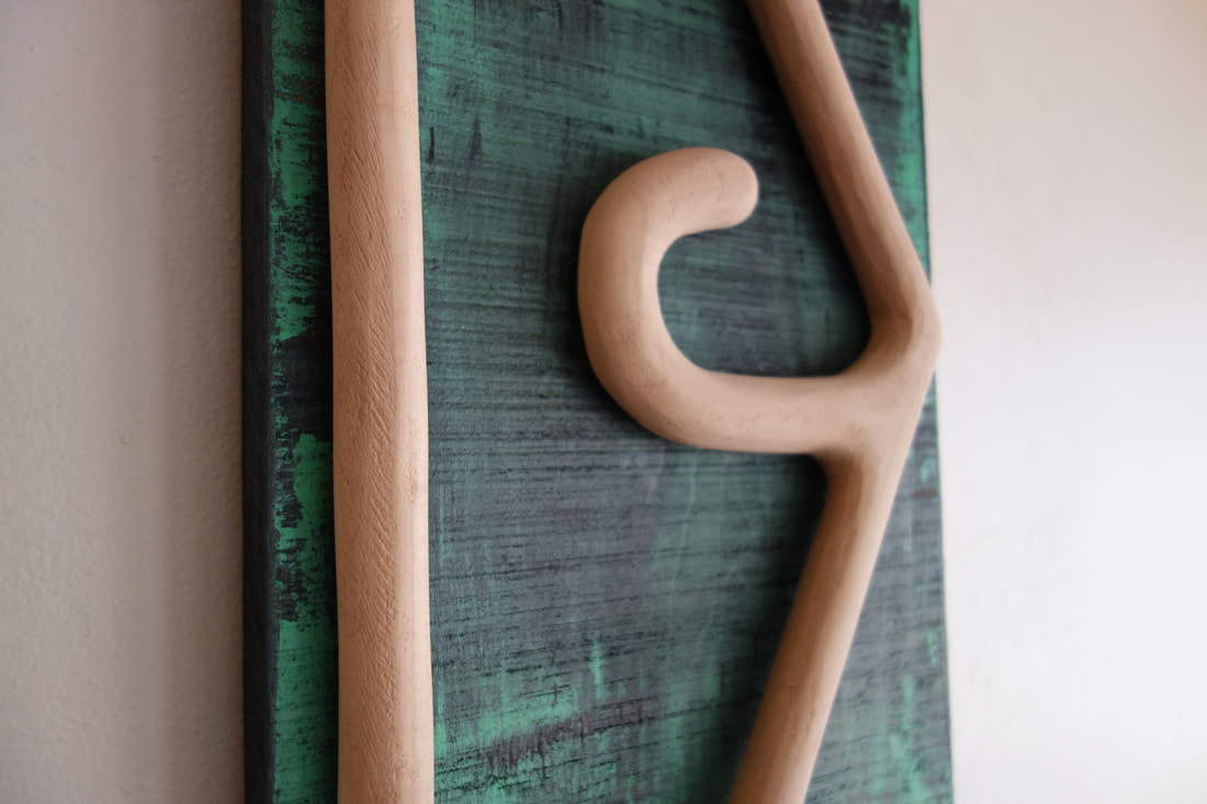
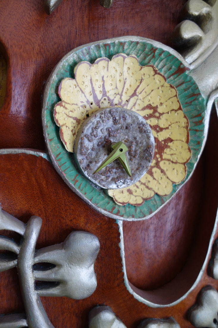
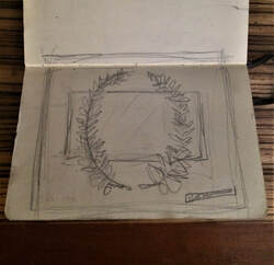
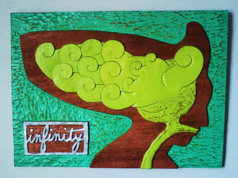
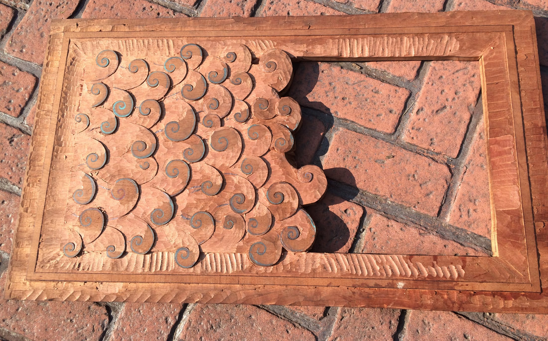
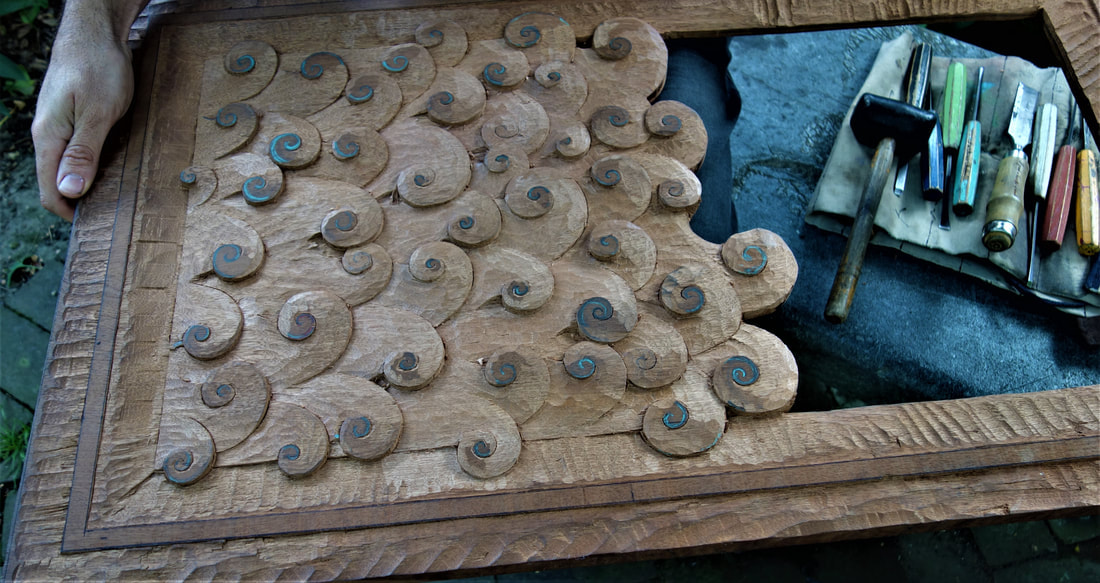
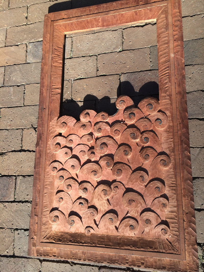
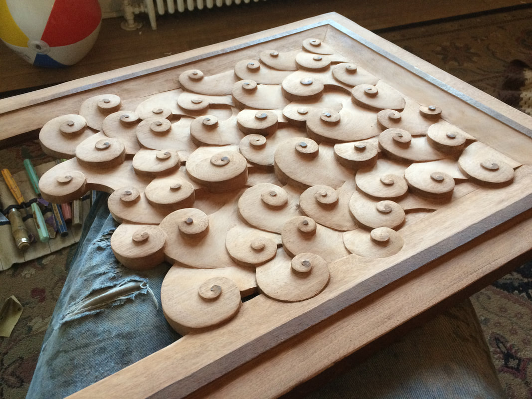
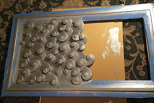
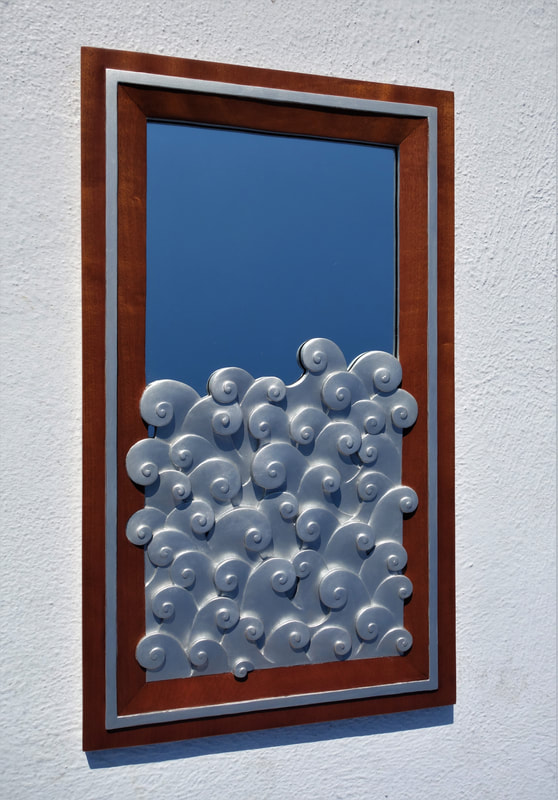
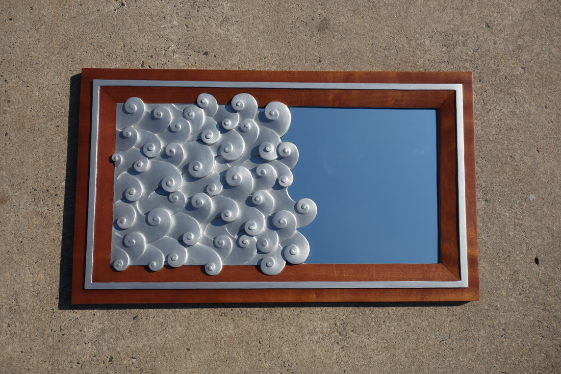
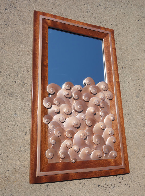
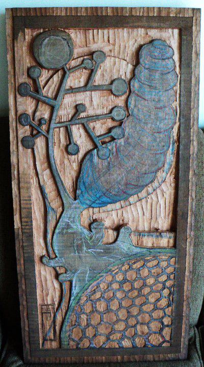
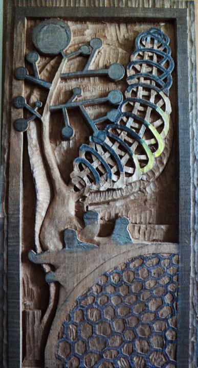
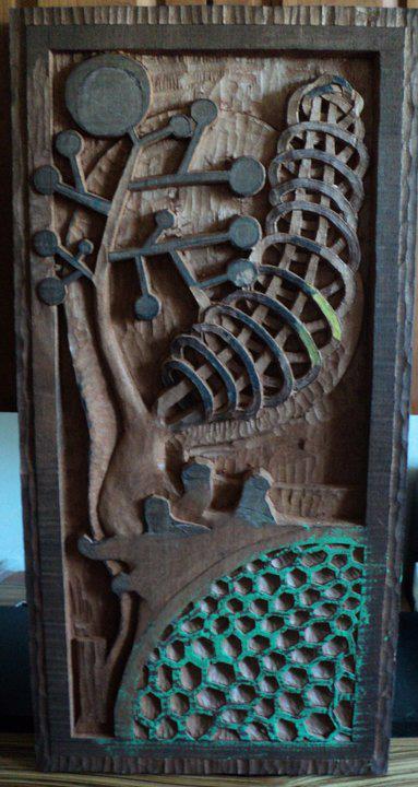
I added the soft "cloud" hugging the pen and so was born my 2010 submission for the Esherick :
I added the soft "cloud" hugging the pen and so was born my 2010 submission for the Esherick :
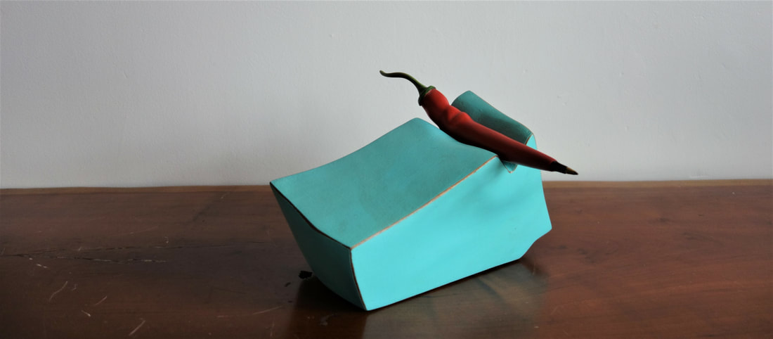
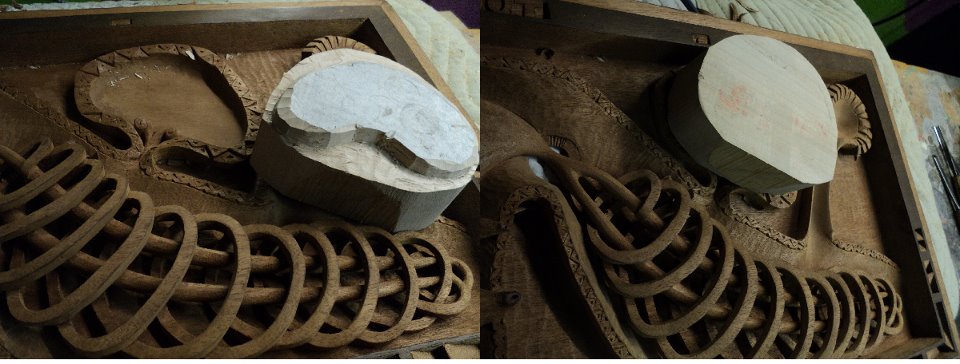
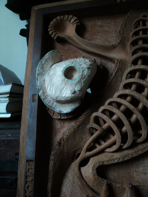
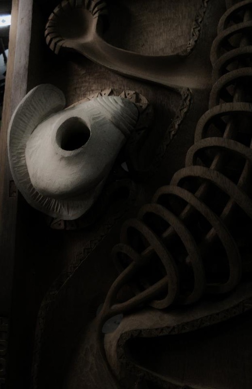
I wanted to the pen cartridge to be easily replaced so incorporated the BIC pen design.
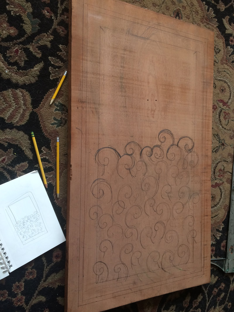
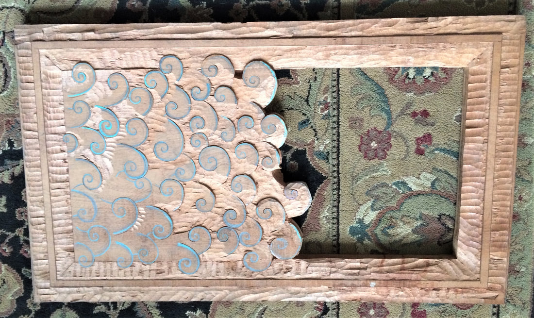
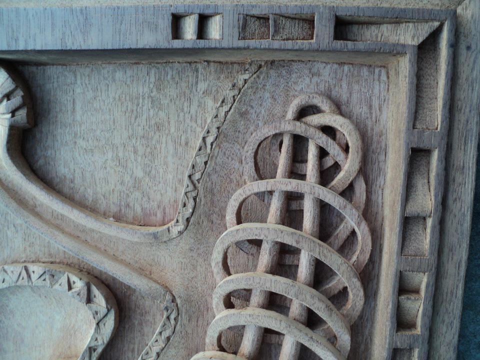
It took me three attempts at carving the jalepeno to get the right feel for the shape/scale of the work but just loved the final result.
It took me three attempts at carving the jalepeno to get the right feel for the shape/scale of the work but just loved the final result.
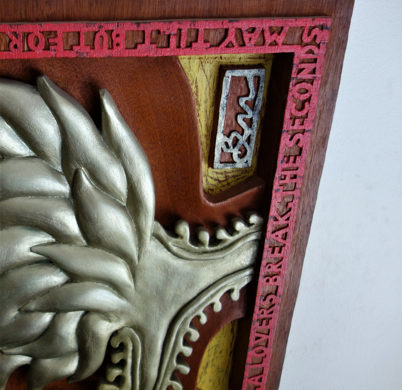
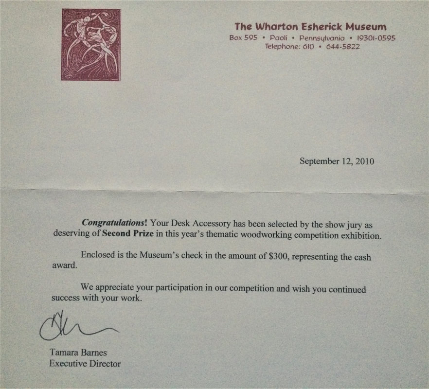
The piece was accepted into the exhibition and won second place.
This piece will always remain a favorite of mine. Not only because it's just dang good! but most importantly because I could create a work with my mom. Someone whom as well as my dad has been there every step of my journey and always been nothing but proud and supportive of who I am.